Mobile Settings
Module: Settings | Platform: Web
Mobile Settings controls the Job Info Layout -- which Job fields appear on the mobile app's Job Info screen, how they're grouped into sections, and in what order. It does not control which modules or cards appear on the mobile landing page, mobile file visibility, or mobile timesheet behavior -- those live on the Mobile Settings card of Instance Settings instead. See What this tab does not control below.
Navigation
Sidebar → Settings → Mobile Settings
Overview
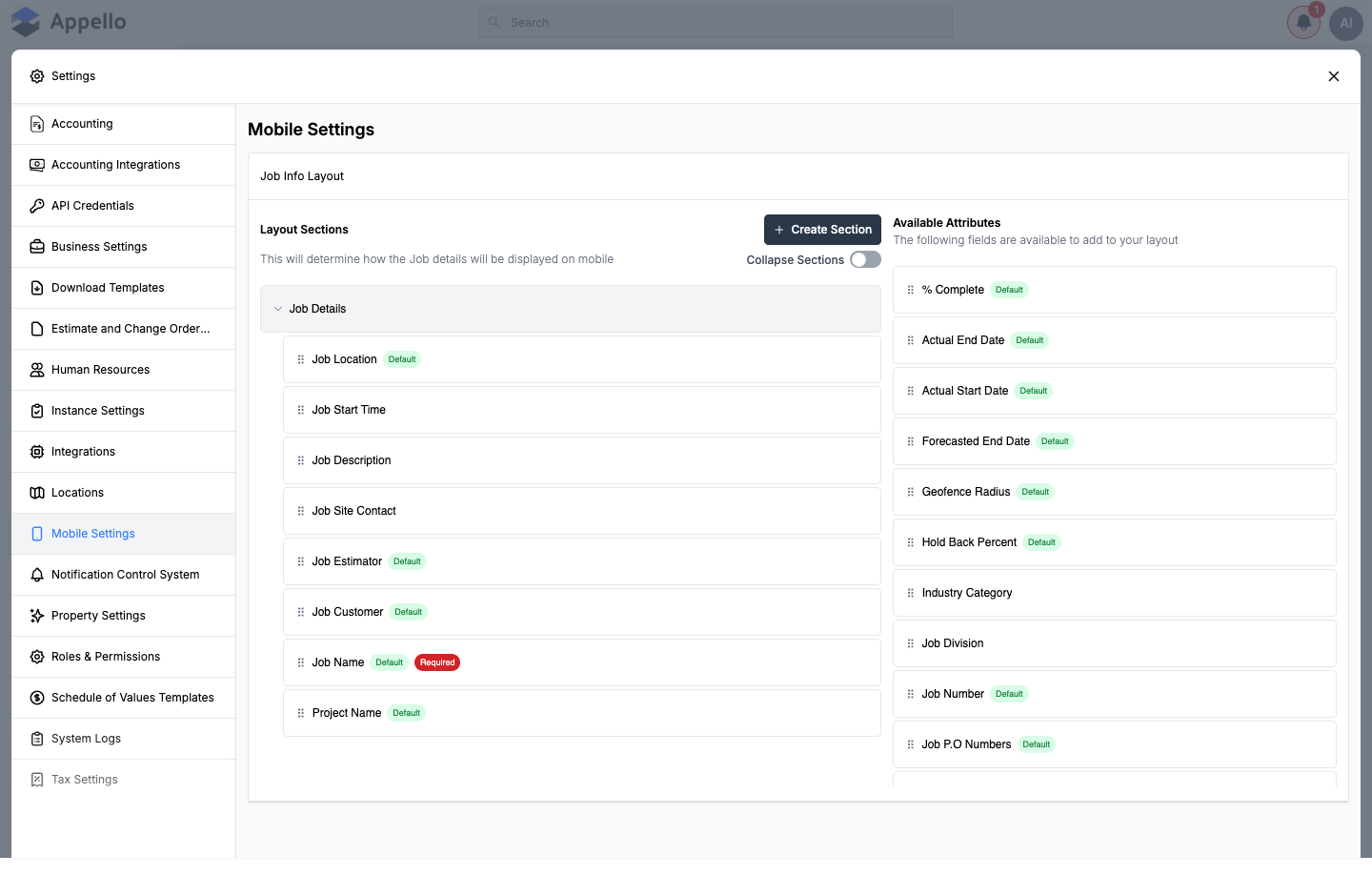
The Mobile Settings tab shows a single card, Job Info Layout. That card is the same two-panel drag-and-drop layout builder used on the Manage Layout / Detail View Layout tabs of Property Settings, pointed at the Job model and set to build the mobile version of its layout instead of the desktop one. Nothing else on this tab is model-specific to mobile beyond that one builder -- there is no sub-tab strip, and the component renders nothing else when you have view access.
What the Job Info Layout builder does
- Layout Sections (left) are collapsible groups -- for example Job Details -- that become the sections field workers see when they open a job on mobile.
- Available Attributes (right) lists every Job field and custom property that is not currently placed in a mobile section. A field only appears on the mobile Job Info screen once you drag it out of this list and into a section on the left -- fields sitting in Available Attributes are defined on the instance but invisible to field workers.
- Drag order matters: the top-to-bottom order of sections in the left panel, and of fields within a section, is the order the mobile app renders them in.
- Each field is tagged with:
- Default (green badge) -- a field Appello ships by default; most core Job fields carry this tag.
- Required (red badge) -- must be filled in before the record can be saved. A field can carry both tags at once.
- An integration badge (e.g. QuickBooks Online) -- shown instead of Default/Required for a field synced from an accounting or other integration.
As of this writing, Available Attributes on the demo instance include: % Complete, Actual End Date, Actual Start Date, Forecasted End Date, Geofence Radius, Hold Back Percent, Industry Category, Job Division, Job Number, Job P.O Numbers, Job Primary Contact, Job Project Lead, Job Rate Type, Job Site Supervisor, Job Source, Job Status, Job Type, Job Wage Region, Planned End Date, Planned Start Date, Scope of Work, Timesheet Submissions Type, and more -- the exact list depends on which custom fields your instance has defined for Job (both built-in Job fields and custom properties created on Property Settings show up here once they aren't yet placed in a mobile section).
Every control on the builder
Layout Sections panel
| Control | Effect |
|---|---|
| Drag handle (per field) | Drag a field up/down within its section, or into another section, to reorder it. |
| Drag handle (per section) | Drag a whole section up/down to reorder it relative to the others. |
| Create Section | Opens an Adding Section dialog (below). Creates a new, empty, collapsible section. |
| Collapse Sections toggle | Expands or collapses every section on the page at once. |
| Chevron (per section) | Expands or collapses that one section. |
| Up/down chevrons (on hover) | Move that field or section one position up or down without dragging. |
| Pencil (edit, on hover) | Opens the field or section editor -- see Adding or editing a section and Editing a field below. |
| X (remove, on hover) | Removes a field from the section (it returns to Available Attributes) or deletes an empty section. See When remove is hidden below. |
Hovering a field or section row reveals its up/down, pencil, and X actions. There is no separate Preview control on this builder.
When remove is hidden
The X (remove) action on a field is hidden when any of the following is true:
- The field is required (by its own definition, or because it's a required default Job field) and has no fallback default value to fall back on once it's removed from the layout.
- The field is synced from an integration (it carries an integration badge instead of Default/Required).
- The field is currently in use elsewhere on the instance.
For a section, the X action only appears once the section is empty (all of its fields have been dragged out or removed).
Adding or editing a section
Clicking Create Section, or the pencil on an existing section, opens the same dialog:
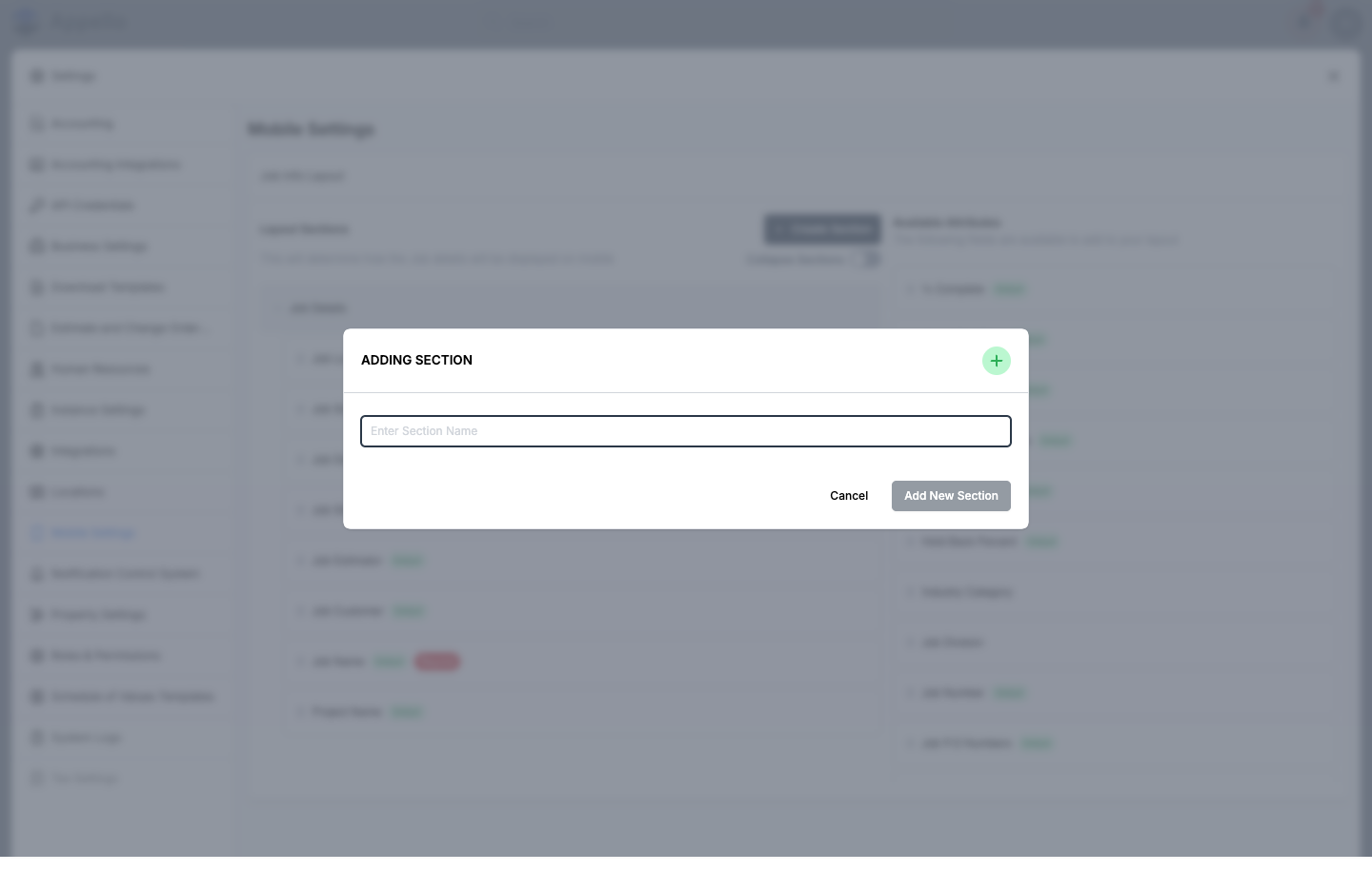
| Field / Control | Required | Notes |
|---|---|---|
| Enter Section Name | Yes | The section's label. Must be unique for the Job model -- a duplicate name is rejected inline. |
| Cancel | -- | Closes the dialog without changes. |
| Add New Section / Update Section | -- | Saves the section immediately (its own save, separate from the builder's Save bar below) and closes the dialog. |
Creating or renaming a section writes immediately when you click Add New Section / Update Section -- it does not wait for the builder's Save bar. Reordering, adding, or removing fields (and reordering sections) is what the Save bar below controls.
Available Attributes panel
There is no Create Section or Create Attribute button on this panel for mobile -- unlike the equivalent desktop layout builder on Property Settings, mobile has only one list to drag from. To make a brand-new custom field available here, create it first from the desktop Custom Properties tab on Property Settings, then drag it into a Layout Sections section on this page to expose it on mobile.
Editing a field
The pencil icon on a field (in either panel) opens the same field editor used everywhere else custom fields are defined -- see Custom Properties for the full field list (name, type, required, placeholder, helper text, list values, linkable object, etc.). Because fields are shared across the instance, renaming or retyping a field here changes it everywhere it's used, not only on the mobile layout.
Save and Cancel
Reordering, dragging, or removing anything in the tree puts the builder into an edited state and pins a bar to the bottom of the page:
| Control | Effect |
|---|---|
| Cancel | Prompts "Leaving unsaved changes?" -- confirming discards your changes and reverts the tree to the last saved layout. |
| Save | Persists the current arrangement of sections and fields as the new mobile Job Info layout, and shows a success notification. |
Save replaces the entire mobile Job layout in one action -- it rebuilds the layout from what's currently shown in the tree rather than merging in just what changed. This is also why adding or renaming a section (above) saves immediately from its own dialog instead of waiting for this Save bar: that's a separate, lighter action that only touches the section itself.
How the layout appears on mobile
The sections and fields configured here appear on the mobile app's Job Details → Info tab, in the same order shown in Layout Sections. Every field's value -- including special cases like a tappable Job Location map link -- is resolved before it reaches the phone, so the layout you build here is what crews see. See Schedule, Directions and Clock In for a screenshot and the rest of the Job Details tab strip.
If a company hasn't configured a Job Info Layout at all, the mobile app falls back to a built-in default field set (Job Customer, Job Name, Job Start Time, Job Description, Job Estimator, Job Location, Job Site Contact, and Project Name) so the Info tab is never empty.
What this tab does not control
This page only builds the Job Info Layout -- the fields on a job's mobile Info screen. Everything else about the mobile app's behavior is configured elsewhere:
- Whether mobile users land on Jobs or Schedule, which job workflow states/sort order show on the Jobs landing page, whether Work Orders are listed alongside Jobs, Full Job Access on Mobile, and Default Visibility for Desktop Files on Mobile -- all on the Mobile Settings card of Instance Settings.
- Mobile timesheet toggles (requiring a note or cost code allocation before submission, and equipment time on mobile timesheets) -- also on that Instance Settings card.
- Clock-in rules, offline behavior, PIN sign-in, and photo quality are not configured on any Settings screen the Mobile Settings tab component renders -- they are mobile app behavior documented on Mobile App Overview and Schedule, Directions and Clock In.
The tabs listed above do not overlap with this one: none of them duplicate the Job Info Layout builder's settings.
Permissions
The Mobile Settings tab is gated by a single permission group, Mobile Settings (listed under Settings Access on Roles & Permissions):
| Permission | Effect |
|---|---|
| Mobile Settings: View | Required to see the Mobile Settings tab in the Settings sidebar at all. |
| Mobile Settings: Edit | Required to drag, add, edit, remove, or save changes in the Job Info Layout builder. |
Without Edit, the tab is visible but read-only -- a banner reading "You don't have the permission to modify this setting" appears instead of edit controls.
Related Pages
- Property Settings -- the same layout builder, used for desktop Detail View Layout / Manage Layout, and where custom fields are created via Custom Properties.
- Instance Settings -- the rest of the mobile-specific configuration this tab doesn't cover.
- Roles & Permissions -- where the Mobile Settings permission is assigned to a role.
- Mobile App Overview -- what the mobile app looks like and what it's for.
- Schedule, Directions and Clock In -- the Job Details Info tab where this layout is rendered.
Tips
- Keep the mobile layout focused -- field workers need quick access to essential job information, not every field.
- Required fields ensure data completeness from the field without relying on office staff to fill gaps.
- Because editing a field's definition here changes it everywhere it's used, prefer renaming or retyping a field from Property Settings when you need to check its other uses first.